
At Airbnb, we are constantly iterating on the user experience and product features. This can include changes to the look and feel of the website or native apps, optimizations for our smart pricing and search ranking algorithms, or even targeting the right content and timing for our email campaigns. For the majority of this work, we leverage our internal A/B Testing platform, the Experimentation Reporting Framework (ERF), to validate our hypotheses and quantify the impact of our work. Read about the basics of ERF and our philosophy on interpreting experiments.
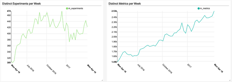
Introduced in 2014, ERF began as a tool that allowed users to define metrics in a common configuration language, and then compute and surface those metrics for a small set of experiments. Since then, the number of concurrent experiments running in ERF has grown from a few dozen (in 2014) to about 500 concurrent experiments (at the time of this post). More impressively, the number of metrics computed per day has grown exponentially, starting with a few dozen (in 2014). Today we compute ~2500 distinct metrics per day and roughly 50k distinct experiment/metric combinations. We also have introduced several advanced features (e.g. dimensional cuts, global coverage, pre-assignment bias checking) that add to our scaling challenge. This post explores the architectural approach that we have taken to solve these problems at Airbnb, and the tradeoffs that we’ve had to consider along the way.
Initial Design
ERF results were originally computed via a Ruby script that executed daily. This script was a simple query generator that assembled and ran a single huge, monolithic Hive query for each experiment. There were several issues with this approach:
- Queries scanned source tables several times, resulting in wild inefficiencies.
- The monolithic nature of the queries did not support “checkpointing”; thus all work had to be reprocessed when failures were encountered. This created a feedback loop. As queries required more time to complete, this increased the likelihood of failure. This, in turn, resulted in more cluster congestion, and ultimately, longer running queries.
- Dependency checking required all metric tables to land before an experiment could be processed.
As adoption grew, the original ERF pipeline did not scale, resulting in a swamped Hadoop cluster and dissatisfied end users.
Migrating to Airflow
To address these issues, ERF was re-written in Python to run in Airflow, a workload orchestrator developed and open-sourced at Airbnb that leverages “configuration as code” principles. This enabled the ERF pipelines to be constructed as dynamically generated Airflow pipelines (a.k.a. DAGs) composed of smaller units of work. Today, we leverage 5 Airflow pipelines to compute ERF assignments, sources, metrics and dimensions, each comprised of thousands of tasks.
Computing by Metric
During the transition to Airflow, we shifted away from computing all of an experiment’s metrics at once, moving the processing unit to the “Event Source” (i.e. a query defining several metrics). This approach had the key advantage of only scanning the source table once, resulting in enormous computational savings. This also resolved the “dependency issue” where a single broken metric sometimes could stall all metrics for a particular experiment. Today, most of an experiment’s metrics are computed independently. After migrating to Airflow and rearchitecting our data pipelines, the run-time of ERF was reduced from 24+ hours to about 45 minutes.
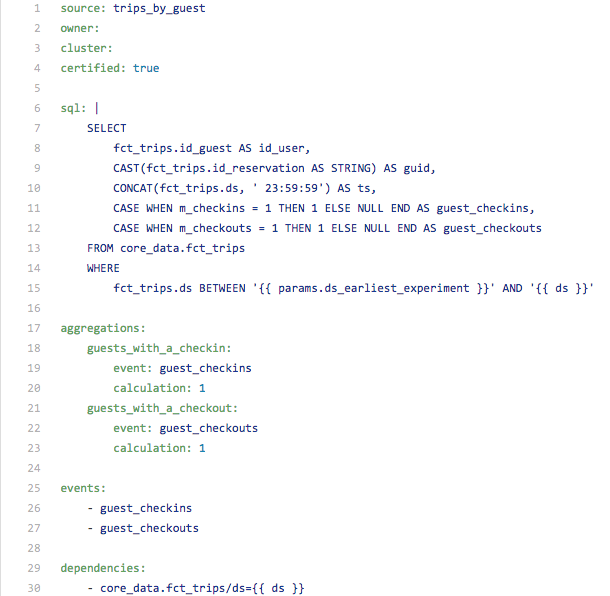
Below is an example of an Event Source definition for “trips by guest”. This file defines two events that are used to compute metrics, and creates two additional aggregations on top of these events.
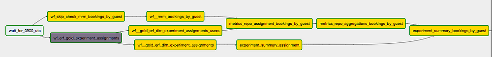
On a given day, ERF independently processes ~350 of these “Event Sources”. This is far more scalable than executing a query for each metric (2.5k) or each metric/experiment combination (50k). The chart below shows an Airflow representation of tasks required to compute a single Event Source. Each Airflow pipeline contains about 350 of these data flows that are executed in parallel.
Metric Hierarchy
With the stability of ERF improved and a more flexible/intuitive configuration syntax, adoption immediately began to thrive. This led to more experiments and a huge influx of new metrics. Things quickly got out of hand with some experiments adopting 100 or more metrics. High-level users didn’t know which metrics were important, and UI overcrowding made it difficult to quickly find top-level metrics. This also made it difficult to ensure SLAs on critical business metrics. To address these issues, we introduced a metric hierarchy.
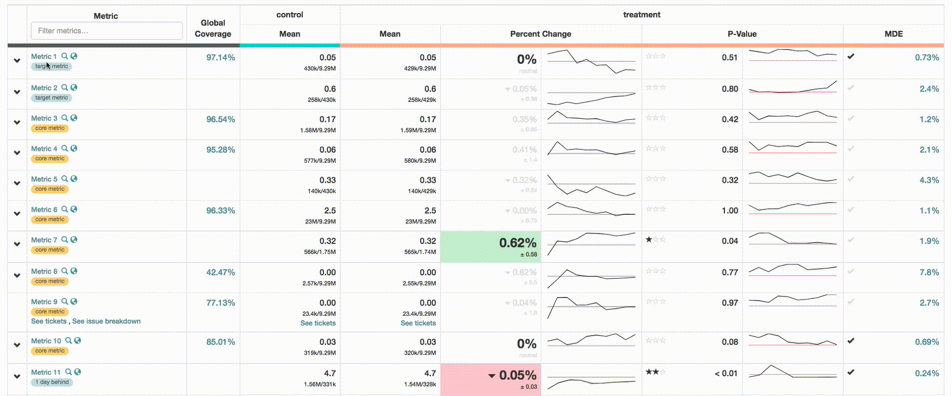
- Core Metrics: Each experiment is required to adopt Core Metrics, a predefined list of critical business metrics. This ensures that all experiment owners are made aware of their impact (even if none is anticipated).
- Target Metrics: Each experiment can specify a list of Target Metrics. These are pinned to the top of the UI to improve visibility for key metrics.
- Certified Metrics: The Data Engineering team certifies around 50% of ERF metrics. These metrics have an SLA guarantee and changes to their definitions are closely audited. All core metrics are guaranteed to be certified metrics.
Dimensional Cuts
Dimensional cuts are one of the most useful features in ERF. This allows users to slice and dice metrics by user attributes (e.g. geography, language, platform) and attributes of the event’s themselves (e.g “instant book” vs non-“instant book” reservations). There are important distinctions between these two types of attributes, which are discussed below.
Subject-level Dimensions
Subject-level attributes enable us to observe response within cohorts/segments of the experiment population. As mentioned before, these dimensions are defined at the subject-level, and correspond to some attribute of each guest or host in the experiment. For instance, we can look specifically at treatment performance for guests from a particular geography (e.g. Europe, France, Paris).
Event-level Dimensions
As ERF adoption began to grow, we noticed a pattern where users were creating variations on metrics, embedding dimensional detail in the definitions themselves. For instance, users created 3 separate booking metrics to independently measure bookings on Android, iOS, and Web. This was in addition to the already existing bookings metric. This approach proved to be unscalable, and contributed to overcrowding in the UI. To resolve this issue, we introduced event-level dimensions.
Event-level attributes are atomic to the event, allowing us to subdivide a metric into its composing parts (e.g. we can explore bookings by the device used to make the booking, or the geography of the destination). One key difference with event-level dimensions is that metrics are computed against the entire experiment population. Subject-level dimensions segment the event and assignments by the dimension, whereas all event-level cuts for an experiment use the same population size. For example, consider the event-level dimensional cut of bookings by whether or not it is instant bookable. In this case, Bookings and Instant Bookings are essentially considered different metrics that are computed against the same population.
Pre-computation and UI
ERF currently precomputes around 50 dimensions for each metric and serves this information instantly in the ERF UI (see gif below). This is the most resource intensive computation in ERF, as data is typically exploded by dimension, and aggregated using GROUPING SETs. The vast quantity of statistical data generated also requires special attention, as this data must be loaded into the MySQL database serving the UI, and optimized for query performance.
Interactive Analysis via ERF Explorer
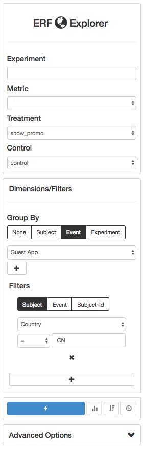
The introduction of precomputed dimensional cuts was hugely successful, but left users wanting to dive deeper into metrics. To accommodate this need, we launched ERF Explorer, a specialized UI that supports drill down and filtering on dimensions. ERF Explorer leverages intermediate datasets (left behind by the main ERF pipelines) to compute stats on the fly via Presto. The tool supports multiple levels of drill down/filtering and other advanced analyses such as quantifying experiment interaction. This enables users to answer virtually any question about their experiment without writing a single database query.
Pipeline logic and Entities
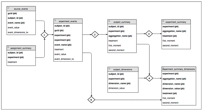
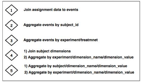
The diagram below describes the entities required to compute ERF metrics and dimensional cuts. The diamond figures represent ETL jobs that join in contextual information (e.g. assignments, dimensions) and aggregate data to the desired grain. In this case, the goal is to compute the first and second moments for each experiment treatment. This is in turn used to compute delta and p-value statistics.
The primary objective of this pipeline architecture is to organize data to minimize computational requirements and prevent duplicate processing. For instance, we compute event-level dimensions from the experiment_events table (see step 5), but choose to compute subject-level dimensions from the subject_summary table. This offers major efficiencies because data has already been aggregated on the join key (i.e. subject_id, experiment).
Future Work
We’ve made enormous strides in experimentation at Airbnb in the past few years. This has been an important lever for the engineering organization, enabling teams to accurately assess the quality of new features and iterate with higher frequency. Despite these gains, there is still a lot of ongoing work in this field at Airbnb. One major project is to leverage metric definitions in ERF to drive company-wide dashboards, supporting slice and dice functionality (powered by Druid). We also have an ongoing project to build support for real-time metrics and custom tools for analyzing Site Performance data.
Special thanks to Maxime Beauchemin, Adrian Kuhn, Jeff Feng, and Gurer Kiratli.