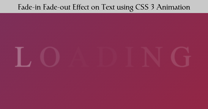
Today I am going to write this tutorial to how you can give a fade-in and fade-out effect to any text using CSS 3 Animation. Its a very simple and easy to understand, basically I am using keyframe ( using @keyframes rule, you can create animations ). I have created a 7 characters fade-in and fade-out one by one and you can use this effect for your loading effect to show that some thing happening on backend.
Let see on our HTML and CSS
<span class='letter'>L</span>
<span class='letter'>O</span>
<span class='letter'>A</span>
<span class='letter'>D</span>
<span class='letter'>I</span>
<span class='letter'>N</span>
<span class='letter'>G</span>
Above HTML create 7 characters LOADING this will fade-in and fade-out.
CSS
<style>
body, html {
text-align: center;
font-size: 90px;
font-family: Poiret One;
height: 100%;
background: -webkit-linear-gradient(315deg, #723362, #9d223c);
background: linear-gradient(135deg, #723362, #9d223c);
overflow: hidden;
color: white;
}
.letter {
position: relative;
top: -webkit-calc(50% - 60px);
top: calc(50% - 60px);
text-shadow: 0px 0px 3px white;
}
.letter:nth-child(1) {
-webkit-animation: fade 4s infinite 200ms;
animation: fade 4s infinite 200ms;
}
.letter:nth-child(2) {
-webkit-animation: fade 4s infinite 400ms;
animation: fade 4s infinite 400ms;
}
.letter:nth-child(3) {
-webkit-animation: fade 4s infinite 600ms;
animation: fade 4s infinite 600ms;
}
.letter:nth-child(4) {
-webkit-animation: fade 4s infinite 800ms;
animation: fade 4s infinite 800ms;
}
.letter:nth-child(5) {
-webkit-animation: fade 4s infinite 1000ms;
animation: fade 4s infinite 1000ms;
}
.letter:nth-child(6) {
-webkit-animation: fade 4s infinite 1200ms;
animation: fade 4s infinite 1200ms;
}
.letter:nth-child(7) {
-webkit-animation: fade 4s infinite 1400ms;
animation: fade 4s infinite 1400ms;
}
@-webkit-keyframes fade {
50% {
opacity: 0.02;
}
}
@keyframes fade {
50% {
opacity: 0.02;
}
}
</style>
Above CSS uses to fade-in fade-out each character and change opacity to 0.2; in keyframe fade, .letter:nth-child(1) points to first character and all above nth-child points to each character. This effect takes 4 seconds to complete.