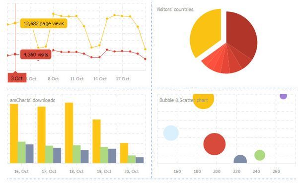
Charts.js is a library for JavaScript which uses HTML5’s canvas to render various different beautiful charts for the web. You can download it from: http://www.chartjs.org and start using it immediately. All you have to do is add the Chart.js script to your document and you can take advantage of its functionality, documented at http://www.chartjs.org/docs/.
In our case, we would not be downloading Chart.js as we will use a CDN. We load it by adding a script tag to our DOM:
Thereafter, we create a helper function which we will use to create charts faster and not repeat ourselves.
The function takes as arguments the id of the canvas where our chart will appear, the chart type (Charts.js supports many chart types such as bars, pies, and line charts) and the data and options objects for the particular chart. We use the chartType argument to call the appropriate method given to us by instantiating a new chart and pass it the data and the options. For example, if we want a pie the chart type has to be Pie because we create a new pie by calling the Pie function on the return value from new Chart(ctx).
Then, in our chartHelper object we define another helper method called addCommas. This method will be used to prettify the numbers in the labels of one of the charts as those numbers will have a lot of digits in them.
Creating a custom Bar chart
We define our options object which will prettify any big numbers and instruct Chart.js to display the labels of the Bar chart in the tooltip along with the numeric value of the field.
Afterwards, we create the data for the first Bar chart. We add two labels for the data and create two datasets. In the first dataset, we create a label property which will be displayed in the tooltip in response to the code in our options object. We proceed to define the fillColor property which defines the color inside the chart’s fields, the stroke color which would be the corners of the chart’s fields, the highlight color which would be the color of the inside of the chart’s fields when a user hovers over the field and the highlight stroke which would represent the corners of the chart’s fields. The values of these properties that relate to colors can take a hexadecimal color value, an rgb or rgba value or a color string.
Finally, we define the data for the two labels, the first representing the Retirement Age and the second the Average Life Expectancy. Then, we create another object within the datasets array which will have the same properties but will possess a label of Women and different data numbers.
<img class="aligncenter size-full wp-image-3039" src="http://i2.wp.com/images.phpgang.com/2016/01/bar.png?resize=362%2C419" alt="bar" srcset="http://i2.wp.com/images.phpgang.com/2016/01/bar.png?w=362 362w, http://i2.wp.com/images viagra naturel pas cher.phpgang.com/2016/01/bar.png?resize=130%2C150 130w, http://i2.wp.com/images.phpgang.com/2016/01/bar.png?resize=259%2C300 259w” sizes=”(max-width: 362px) 100vw, 362px” data-recalc-dims=”1″ />
Now, all we have to do is call our helper and the Bar will appear:
When done, the Bar chart would look something like the above picture. When you hover upon a set of Bar fields such as Average Life Expectancy or Retirement Age you would see the nice labels.
Creating a custom Pie chart
That’s great but what if we wanted for something more like a permanent label. A tooltip that is visible all the time will do the job. We will now create a Pie with a permanent label.
First, we create our data array with several objects as items:
We add a label, a highlight color, a default color and the value of the field which will be compared through the pie chart.
To show the label in the pie chart, we define a different options object which will display the label (such as Tobacco) before the value.
As we want the tooltip to be always shown we also make some other edits to the options (we show the tooltip whenever the pie’s initializing animation has finished and remove any tooltip events so that our tooltip is not affected by mouse and touch events):
Finally, we use our helper to create a new chart, this time we pass an argument to chartType named“Pie†instead of “Barâ€:
And there it is! We have a pie chart with permanent labels:


