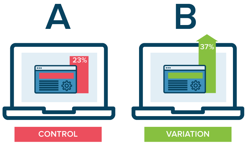
A/B tests provide us with a way of testing two versions of something to know which is most successful. Here is an example of a simple AB Testing:
Have you ever argued with a colleague on the shortest route to a particular destination? How did you settle that argument? You tested it! You just left your place of work at the same time and left using the different routes to determine the best one.
We can use A/B testing to compare two versions of a web page to know which version is the best. This is very helpful since different audiences exhibit different behaviors. One feature may work for one company, but it may not work for another. There are many free ways to create websites today. However, it is important to ensure that the website you created with a free website builder is effective and engaging. This can be achieved by running AB testing on the website. Furthermore, A/B tests can be conducted on just about every aspect of your website.
AB Testing Content
The length of the text that you add to a web page has an impact on conversion rates. It can be difficult to tell the ideal amount of text that you need to explain your idea to visitors while maximizing conversions. A great solution is to run an A/B test by presenting various lengths of text to different visitors.
Other than the length, there are other aspects of a text that you can test. Try using different power words, pronouns, and action verbs. For example, you change the text on your CTA (call to action) button from Sign Up to Learn More!
Headline
This is the first thing that your web visitors will see. This means that it can either grab their attention or cause them to click away too quickly. Run an A/B test on ten or more headlines before you finally settle on the best one to use.
Call-to-Action
The text you use for your CTA is critical. For example, there is a difference between “Buy” and Buy Now.” These two convey two different senses of urgency and so have different conversion rates. Play around with this, run A/B tests on different CTA text, and see which one is better!
Again, the position of the CTA is very important. In most cases, this is added in the middle of the page because that is what we are used to. Little do people know that adding the CTA at the bottom of the web page can increase the conversion rate by a great percentage. Test it at different positions and see which one works best for your site.
Images
One of the primary purposes of using images on a site is to convey emotion. Different images will have different impact and convey different emotions. Sometimes, it is obvious which images will have the best effect. In other cases, however, is not easy to know which images which will have a positive impact and those with a negative impact on your audience and therefore on conversions. It’s best to play around with several images and choose the most persuasive one.
Font Size
The size of the font that you use has an impact on how your audience reacts. Different types of font are better when used at certain sizes. For example, Tahoma is best at 10 px, Courier and Verdana are great at 12 px, while Arial is good at 14 px.
Choose the typeface that you like and vary its size. Assess the performance of the font at different sizes by measuring click-throughs and user engagement.
Color
There is no doubt that color is a game changer! Use different colors for your CTA and see which one that generates more conversions. For instance, a red CTA button has been found to generate 21% more conversions than a green one.
Other research has shown that a green Add to Cart button generates 35.85% more sales than a blue one.
The color is only relevant for the CTA and the Add to Cart buttons, but can have an impact on just about every aspect of your site. Use different colors for the various sections and see what works best.
Free Trial Length
You may use free trial as a way of attracting potential buyers. If so, how long should the free trial last? It can be 7, 14, 14, 21, or 30 days. You need to test this!
Many companies have found shortening the free trial period from 30 days to 14 days very effective. However, the results will differ depending on the niche you are in, and so testing is important.
Pricing Plans
You must not forget to run A/B tests for your pricing plans. Play around by giving different prices for different plans. Also, play around with the various features of the plans. This way, your higher-ticket plans will convert faster.
Background
The background of your landing page has an impact on readers. You can use images, pattern or solid colors in the background. If you fail to use these, you may have lost some potential conversions. A company like Dell saw a 36% rise in conversions after changing the background from solid white to an image with people.
Navigation Links
The way you present navigation menus will determine how well or poor you get visitors to the money pages. You need to test this by varying the number of links, their position, and the menu color.
Contact Form
The contact form you preset to your visitors will determine whether they will leave their information, which is vital for building contact lists and collecting leads. Vary the number of fields and their type and see whether you get more submissions.
Conclusion
AB testing are used to compare different versions of something and determine which one works best. A/B tests are critical in creating a persuasive, effective website that converts. Nearly all the elements of a website can be subject to A/B testing to determine the most effect way of doing things. It is important to vary aspects of the website such as text color, text size, font type, images, and others. By conducting A/B tests before committing yourself to what to use on your website, you may greatly increase the number of conversions, meaning more sales, profits, and a more successful business.