I have found a good mobile based swipe tab here and really loved it so now I am sharing it with you. Its very simple and very useful tutorial you can use these tabs in your mobile based website or hybrid mobile apps.
index.html file contain all the tabs scripting:
<div class="swipegory">
<nav>
<ul>
<li><a href="#item1">PHPLift</a></li>
<li><a href="#item2">FRAMEWORK</a></li>
<li><a href="#item3">BOOTSTRAP</a></li>
<li><a href="#item4">JAVASCRIPT</a></li>
<li><a href="#item5">CSS 3</a></li>
<li><a href="#item6">HTML 5</a></li>
<li><a href="#item7">PHP</a></li>
</ul>
</nav>
<ul class="panes">
<li>
<h1>PHPLift</h1>
<p><b>Create fly to cart / basket effect for eCommerce using jQuery and CSS</b></p>
<p><img src="http://www.phplift.net/wp-content/uploads/2018/06/Create-fly-to-cart-basket-effect-for-eCommerce-using-jQuery-and-CSS-265x160.png" /></p>
</li>
<li>
<h1>Frameworks</h1>
<p><b>8 Best PHP Frameworks Of 2017 For Developers</b><br><br>Most of the developers found PHP is the right developing language which works perfectly from server-side. Using such type of scripting languages has been boomed since the interdiction of inline code in static HTML.</p>
</li>
<li>
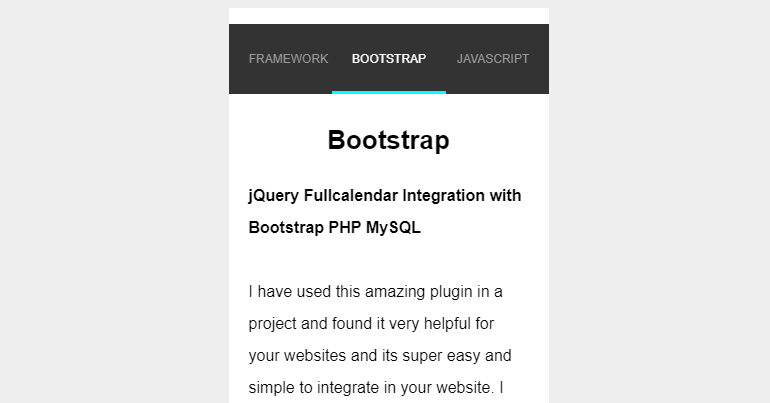
<h1>Bootstrap</h1>
<p><b>jQuery Fullcalendar Integration with Bootstrap PHP MySQL</b><br><br>I have used this amazing plugin in a project and found it very helpful for your websites and its super easy and simple to integrate in your website. I have used bootstrap With PHP & MySQL very simple and easy steps.</p></li>
<li>
<h1>JavaScript</h1>
<p><b>Useful JavaScript globals</b><br><br><img src="http://www.phplift.net/wp-content/uploads/2017/03/JavaScript-tips-and-tricks-265x160.png" /></p>
<li>
<h1>CSS 3</h1>
<p><b>Cool CSS3 features</b><br><br><img src="http://www.phplift.net/wp-content/uploads/2017/03/Cool-CSS3-features-265x160.png" /></p>
</li>
<li>
<h1>HTML 5</h1>
<p><b>Cool HTML5 features</b><br><br>You can be more specific, for example, by stipulating image/png instead of the wildcard image/* which accepts all kinds of images. When you add the accept attribute and the user is shown the file dialog, he would be able to select only files from.</p>
</li>
<li>
<h1>PHP</h1>
<p><b>Passing input parameters in PHP</b><br><br><img src="http://www.phplift.net/wp-content/uploads/2017/03/Passing-input-parameters-in-PHP-265x160.png" /></p>
</li>
</ul>
</div>
script.js
var autoAdjustHeight = true;
// update on click
$('nav a').on('mousedown', function(e){
e.preventDefault();
var goTo = $(this).parent().index();
swipegoryUpdate(goTo);
});
// update on touch
$("ul.panes").swipe({
swipeStatus:function(event, phase, direction, distance, duration, fingerCount) {
var translateString = 'translate3d(0px, 0px, 0px)';
var transitionDuration = $('nav li.cur').css('transitionDuration');
var speed = transitionDuration;
if(phase == 'move') {
speed = '0ms';
if(direction == 'left') {
translateString = 'translate3d(-' + distance + 'px, 0px, 0px)';
$('.panes li.cur').css('marginLeft', '-'+ distance +'px');
}
else if(direction == 'right') {
translateString = 'translate3d(' + distance + 'px, 0px, 0px)';
$('.panes li.cur').css('marginLeft', distance +'px');
}
$('nav li.cur').css({
transitionDuration: speed,
transform: translateString
});
}
else if (phase == 'end') {
// reset transform3D
var marginLeft = $('nav li.cur').css('marginLeft');
$('nav li.cur').attr('style', '').css('marginLeft', marginLeft);
$('.panes li.cur').attr('style', '');
}
},
swipeLeft:function(event, direction, distance, duration, fingerCount) {
//This only fires when the user swipes left
var goTo = $('nav li.cur').index();
goTo++;
swipegoryUpdate(goTo);
},
swipeRight:function(event, direction, distance, duration, fingerCount) {
//This only fires when the user swipes left
var goTo = $('nav li.cur').index();
goTo--;
swipegoryUpdate(goTo);
},
threshold: 50,
triggerOnTouchEnd: false,
allowPageScroll: "vertical",
excludedElements: "button, input, select, textarea, .noSwipe"
});
// update on load
$(window).load(function() {
swipegoryUpdate(0);
});
function swipegoryUpdate(goTo) {
var listItems = $('nav li');
var panes = $('.panes');
var prev = goTo - 1;
var next = goTo + 1;
if(goTo >= 0 && goTo < listItems.length) {
listItems.removeClass('prev').removeClass('cur').removeClass('next').removeClass('before').removeClass('after');
$('li', panes).removeClass('prev').removeClass('cur').removeClass('next').removeClass('before').removeClass('after');
listItems.each(function(i) {
var li = $(this);
var pane = $('li:eq('+i+')', panes);
li.attr('style', '');
if(i == prev) {
li.addClass('prev');
li.css('margin-left', '0');
pane.addClass('prev');
}
else if(i == next) {
li.addClass('next');
li.css('margin-left', '-' + li.outerWidth() + 'px');
pane.addClass('next');
}
else if(i < goTo) {
li.addClass('before');
li.css('margin-left', '-' + li.outerWidth() + 'px');
pane.addClass('before');
}
else if(i == goTo) {
li.addClass('cur');
var marginLeft = li.outerWidth() / 2;
li.css('margin-left', '-' + marginLeft + 'px');
pane.addClass('cur');
if(autoAdjustHeight == true) {
$('.swipegory').css('height', pane.outerHeight() + li.outerHeight());
}
}
else if(i > goTo) {
li.addClass('after');
li.css('margin-left', '0');
pane.addClass('after');
}
});
}
}
style.css
* {
box-sizing: border-box;
}
html,
body {
height: 100%;
}
body {
padding: 0;
background: #eee;
font: 16px/2em 'Montserrat', sans-serif;
}
img {
max-width: 150px;
heigth: auto;
display: block;
margin: 0 auto;
}
h1 {
text-align: center;
font-size: 26px;
margin: 10px 0 20px 0;
}
p {
margin: 0 0 20px 0;
}
p.footer {
font-size: 12px;
text-align: center;
}
.swipegory {
position: relative;
max-width: 320px;
height: 480px;
margin: 0 auto;
background: #fff;
padding-top: 70px;
overflow: hidden;
transition: 1s height;
transform: translate3d(0, 0, 0);
margin-bottom: 5px;
}
.swipegory nav ul {
position: absolute;
top: 0;
left: 0;
width: 100%;
height: 70px;
background: #333;
}
.swipegory nav li {
position: absolute;
top: 0;
left: 100%;
display: block;
transition: 1s all;
transform: translate3d(0, 0, 0);
line-height: 70px;
height: 70px;
font-size: 12px;
text-transform: uppercase;
}
.swipegory nav li.prev {
left: 0;
}
.swipegory nav li.cur {
left: 50%;
}
.swipegory nav li.cur a {
color: #fff;
}
.swipegory nav li.cur a:after {
opacity: 1;
transform: translate3d(0, 0, 0);
}
.swipegory nav li.next {
left: 100%;
}
.swipegory nav li.before {
left: 0;
}
.swipegory nav li.after {
left: 100%;
}
.swipegory nav li a {
position: relative;
color: #999;
text-decoration: none;
padding: 0 20px;
height: 70px;
line-height: 70px;
display: block;
overflow: hidden;
transition: 1s color;
}
.swipegory nav li a:after {
content: ' ';
position: absolute;
bottom: 0;
left: 0;
background: cyan;
width: 100%;
height: 3px;
opacity: 0;
transition: 1s all;
transform: translate3d(0, 3px, 0);
}
.swipegory ul.panes {
position: absolute;
width: 100%;
height: 100%;
cursor: move;
}
.swipegory ul.panes li {
position: absolute;
top: 0;
left: 100%;
width: 100%;
padding: 20px 20px 0 20px;
transition: 1s all;
transform: translate3d(0, 0, 0);
}
.swipegory ul.panes li.prev {
transform: translate3d(-200%, 0, 0);
}
.swipegory ul.panes li.cur {
transform: translate3d(-100%, 0, 0);
}
.swipegory ul.panes li.next {
transform: translate3d(0, 0, 0);
}
.swipegory ul.panes li.before {
transform: translate3d(-200%, 0, 0);
}
.swipegory ul.panes li.after {
transform: translate3d(0, 0, 0);
}
@media all and (min-width: 320px) {
body {
padding: 20px 0;
}
}
I hope you like it please feel free to ask question in below comments section.